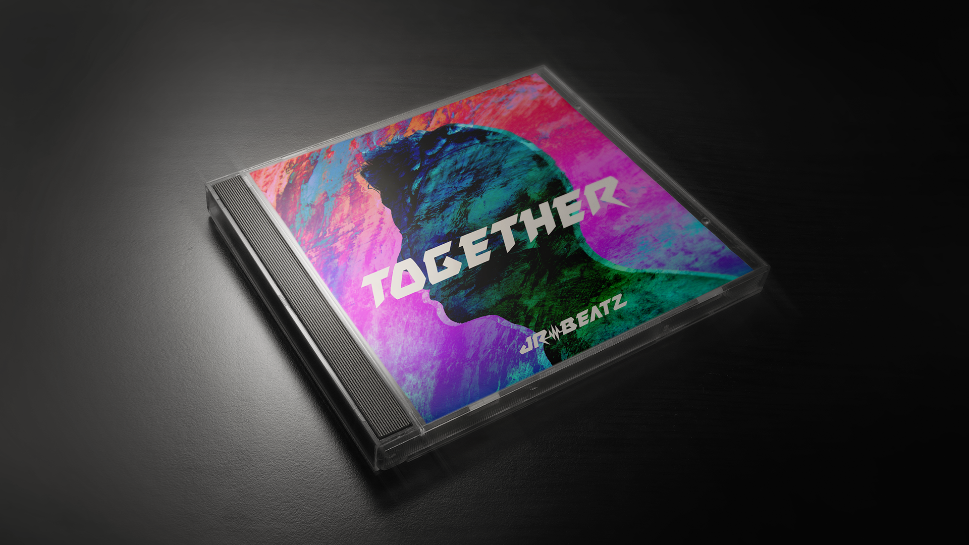
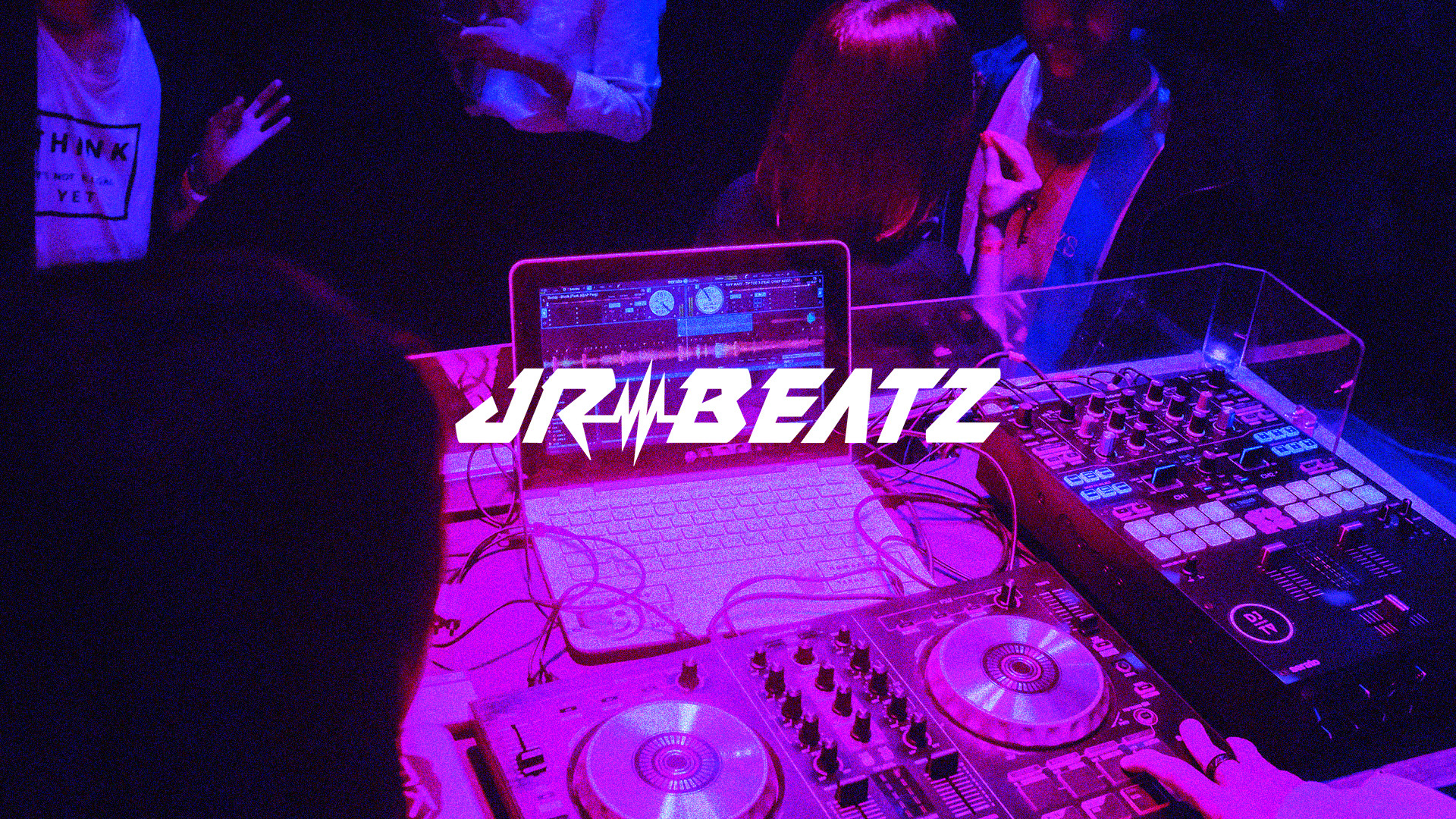
Josh Rivas, or JR-Beatz is a multi-talented music producer and sound engineer based in San Jose, California. He produces his own electronic dance music (EDM) and specializes in mastering for local hip hop artists such as Chine Slender, LO-SO, Ambition, and White J. Although he may not be well-known to the general public, Josh contributes to the success of various artists and helps them achieve their desired sound.
The Goal?
To establish a strong brand identity that accurately represents his music style and helps to build his reputation as an artist. By creating a cohesive and consistent visual identity, he hopes to stand out in the industry and connect with his audience on a deeper level.

BRAND IDENTITY
CHARACTERISTICS
Bold | Energetic | Vibrant | Futuristic | Clean | Creative | Simple | Clear
01 | Logo Concept
MAIN IDEAS
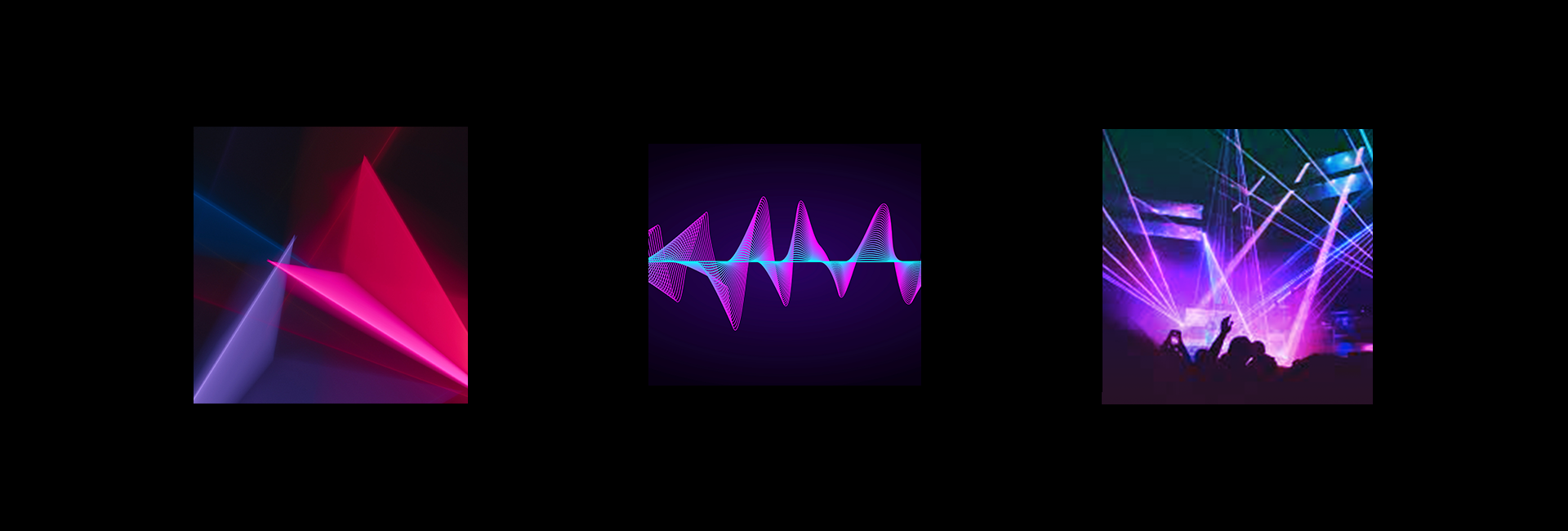
Movement | Expressive Shapes
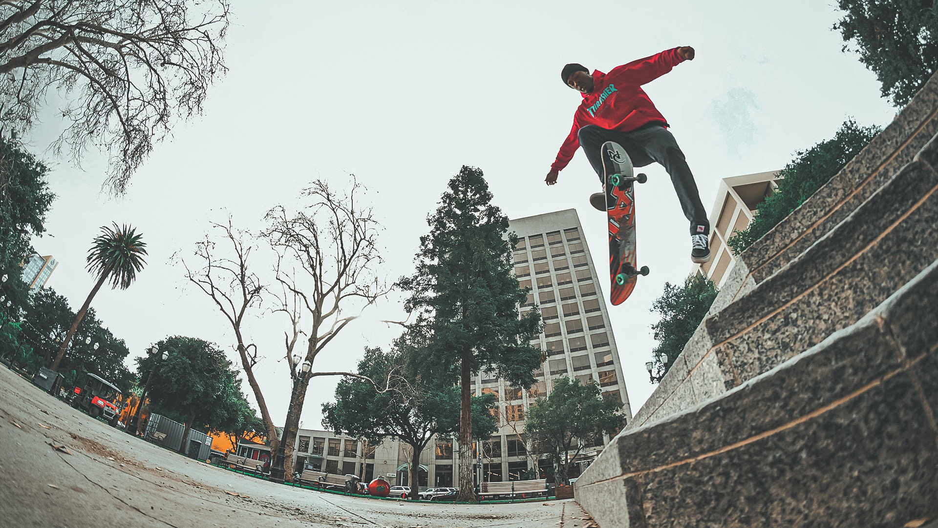
Electronic music is characterized by fast tempos and driving beats, often in the range of 120-140 beats per minute. This inspires movement that can range from up-beat to chaotic.
Music | Sound Waves
Sound waves are the fundamental building blocks of music, allowing musicians to create a vast array of musical tones, melodies, and harmonies. In the recording studio, sound waves are captured and manipulated to create the desired sound of a recording.
Energy | Vibrant Lights & LEDs
Electronic music is high-energy in nature. LEDs (light-emitting diodes) are a common lighting technology used to enhance the visual experience of performances. They can be used to create dynamic and colorful lighting effects that synchronize with the music, providing an immersive and interactive experience for the audience.
VISUAL INTERPRETATION
ABSTRACTION
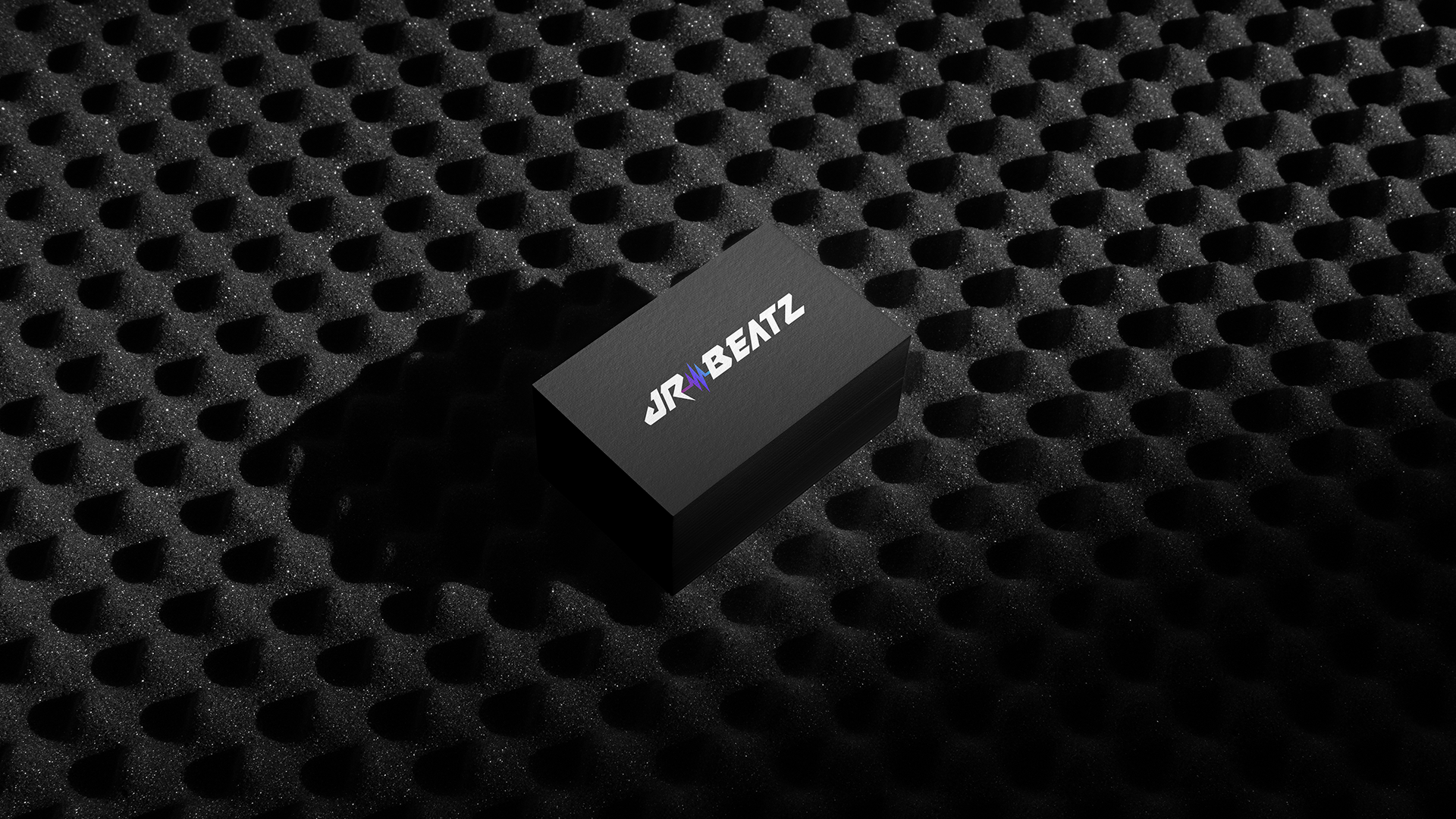
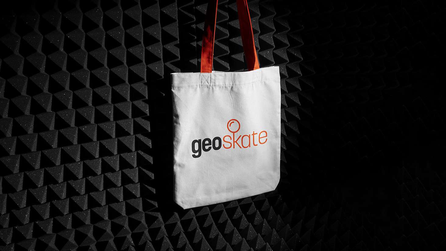
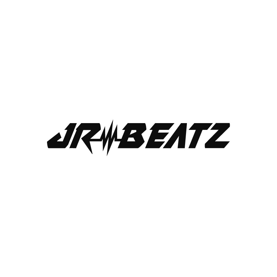
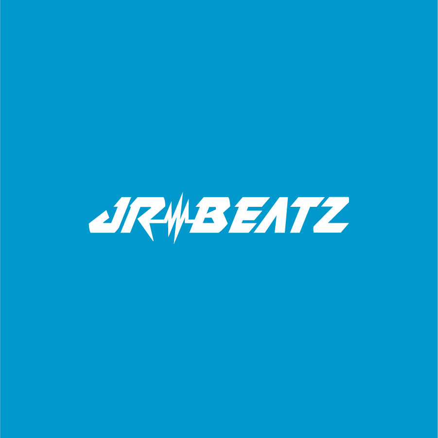
Final Logo
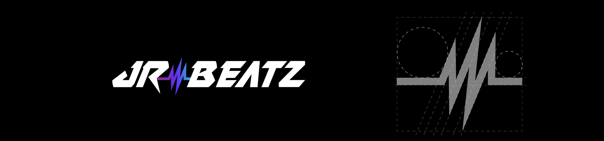
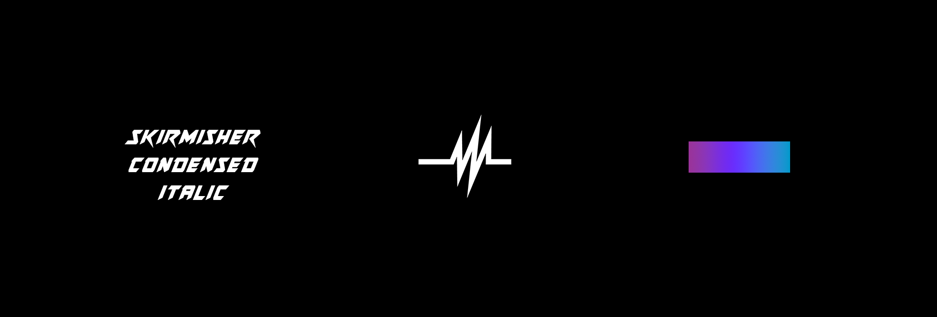
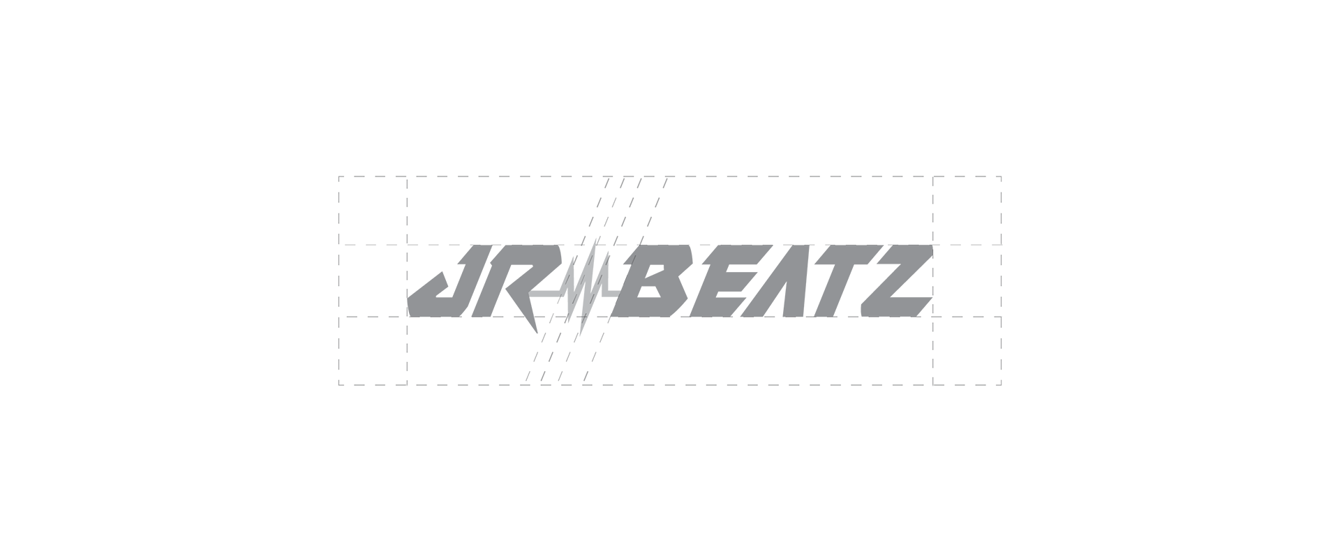
At its core, the logo is constructed from Skirmisher Condensed Italic, a typeface that features a condensed and slanted design. The font has a narrow width and a slight slope that leans towards the right, giving it a dynamic and energetic appearance that felt like a good match to the music Josh creates. I had to modify some of the letters, and completely redesign the "A" in order to bring back some balance between all of the elements.
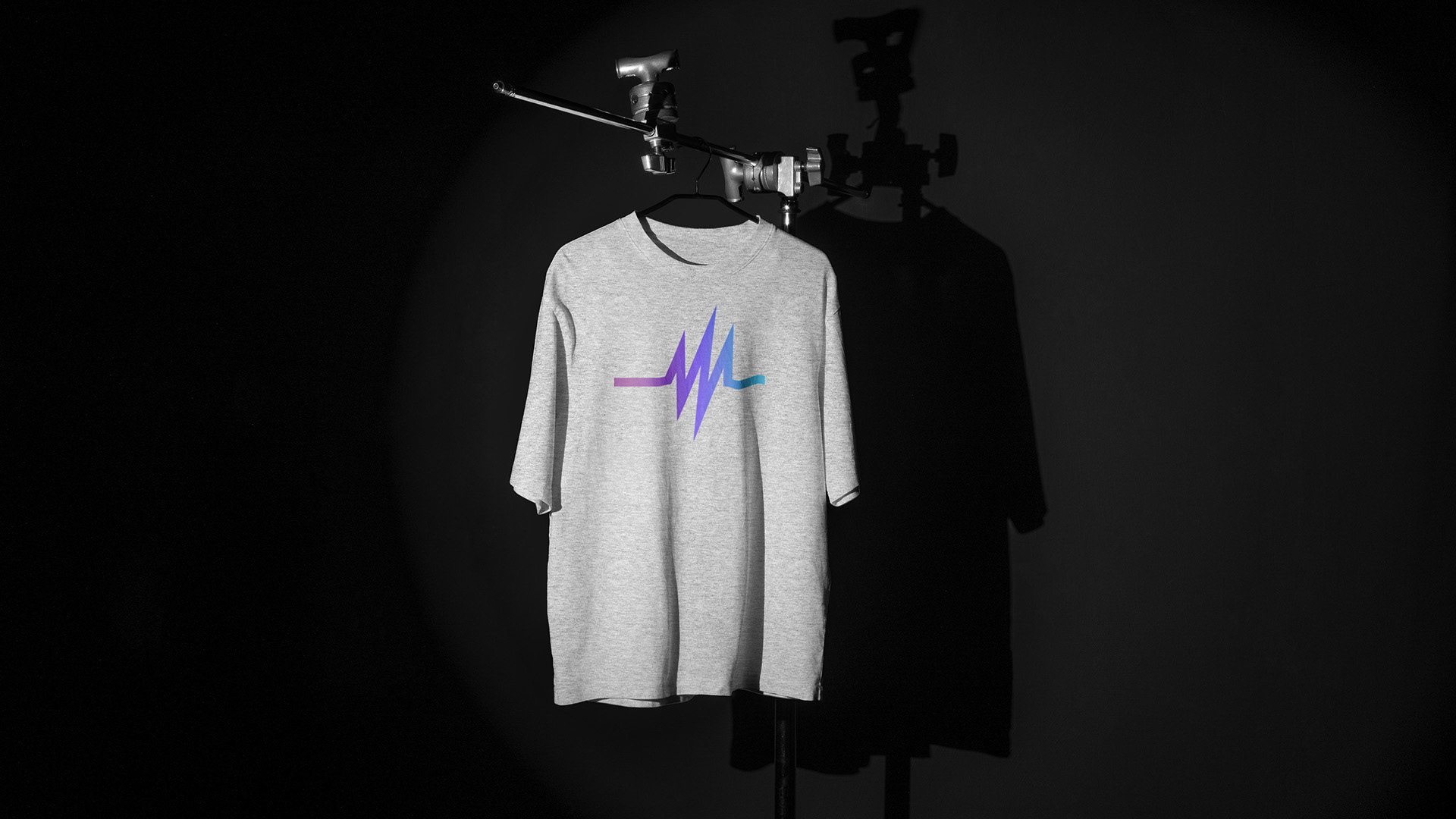
The main element in the logo is the sound wave, which acts as a connecting point within the name. It has been drawn to match the slight slope that is seen in the typeface, further enhancing the sense of movement within the logo. It is also a key element that will get reused throughout the branding system.
The final element is the color gradient that has been applied to the sound wave icon. This is done intentionally to add some interest to the logo, while speaking to the many chacteristics of the live performances for this type of music. Overal, the logo is simple yet effective in speaking to the audiences he is targeting.


02 | Color Palette

MAIN Colors
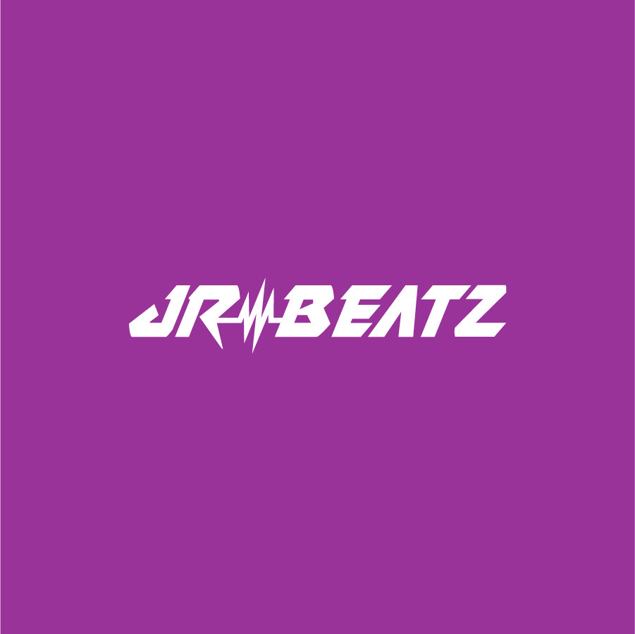
UpBeat Magenta (HEX: 993399)
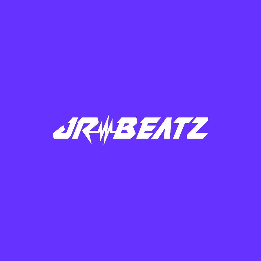
Tempo Purple (HEX: 6633FF)
Inspiration Blue (HEX: 0099CC)

Neutral Colors
Spot Light White (HEX: FFFFFF)
Mixer Gray (HEX: 333333)
Underground Black (HEX: 000000)
03 | Typography
Titles | Aktive Grotesk Black
ABCDEFGHIJKLMN
OPQRSTUVWXYZ
abcdefghijklmnop
qrstuvwxyz
1234567890
Paragraphs | Aktive Grotesk Regular
Lorem ipsum dolor sit amet, consectetur adipiscing elit, sed do eiusmod tempor incididunt ut labore et dolore magna aliqua. Ut enim ad minim veniam, quis nostrud exercitation ullamco laboris nisi ut aliquip ex ea commodo consequat. Duis aute irure dolor in reprehenderit in voluptate velit esse cillum dolore eu fugiat nulla pariatur. Excepteur sint occaecat cupidatat non proident, sunt in culpa qui officia deserunt mollit anim id est laborum.