GeoSkate is an innovative platform that connects skateboarders from all around the world. It offers users a range of features including a skate spot mapping tool, trick tutorials, gear recommendations, and a social platform for connecting with other skateboarders. The app is designed to help skateboarders discover new spots, learn new tricks, and stay up-to-date with the latest events and trends in the skateboarding community. Overall, this app is an essential tool for any skateboarder looking to improve their skills and connect with other riders.
The Goal?
Design an impactful logo that carefully considers the company's mission, target audience, and industry. Brand colors and imagery moodboard were provided. My job was to design the logo that would bring it all together. During my process, I found a few elements from the logo that could be integrated into the visual identity of the brand. Check it out below!
Brand Colors
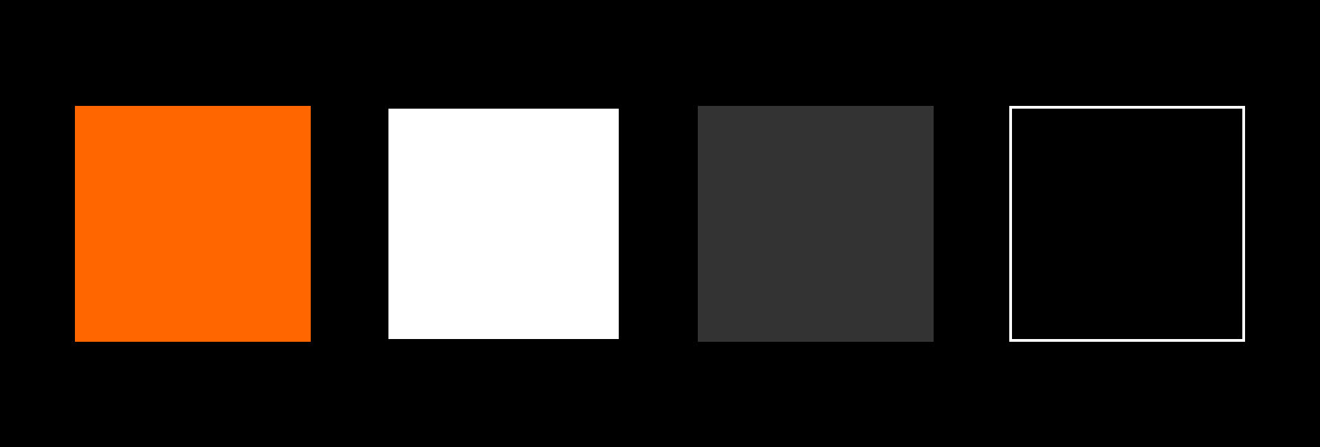
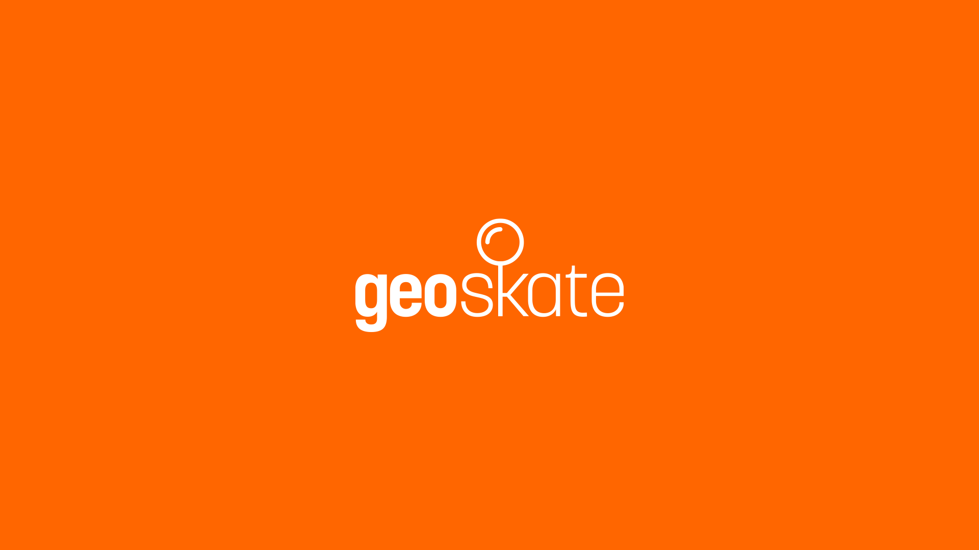
GeoSkate Orange (HEX: FF6600)
Sky White (HEX; FFFFFF)
Concrete Gray (HEX: 333333)
Grip Black (HEX: 000000)
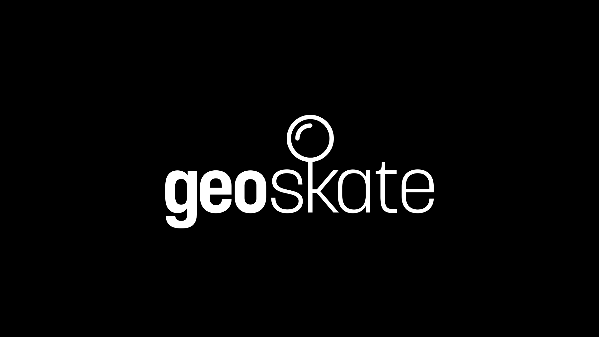
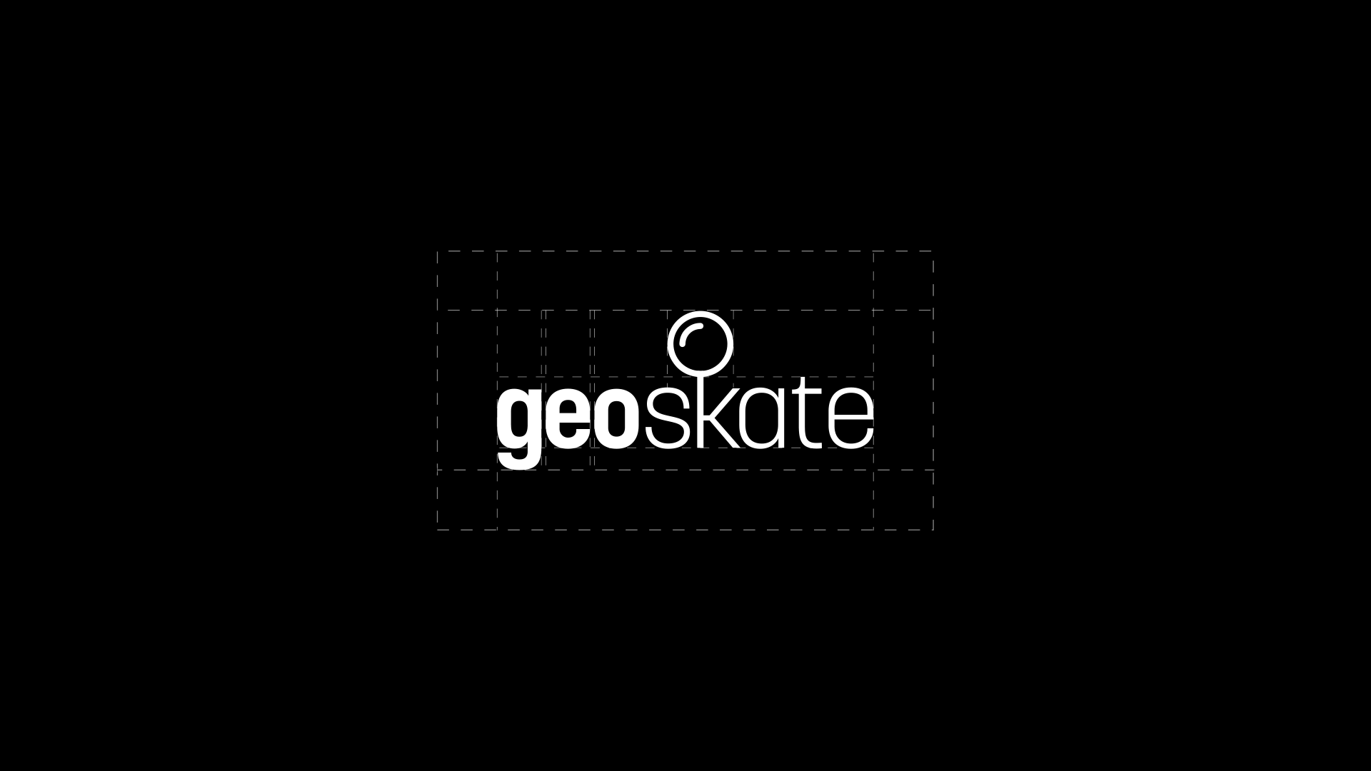
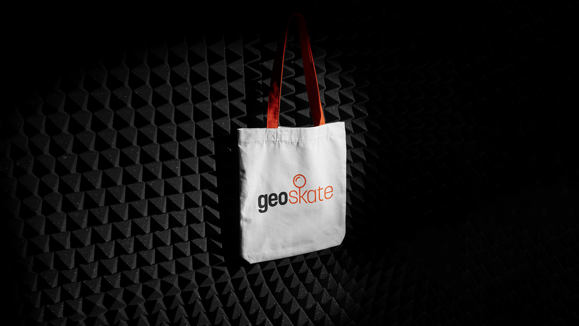
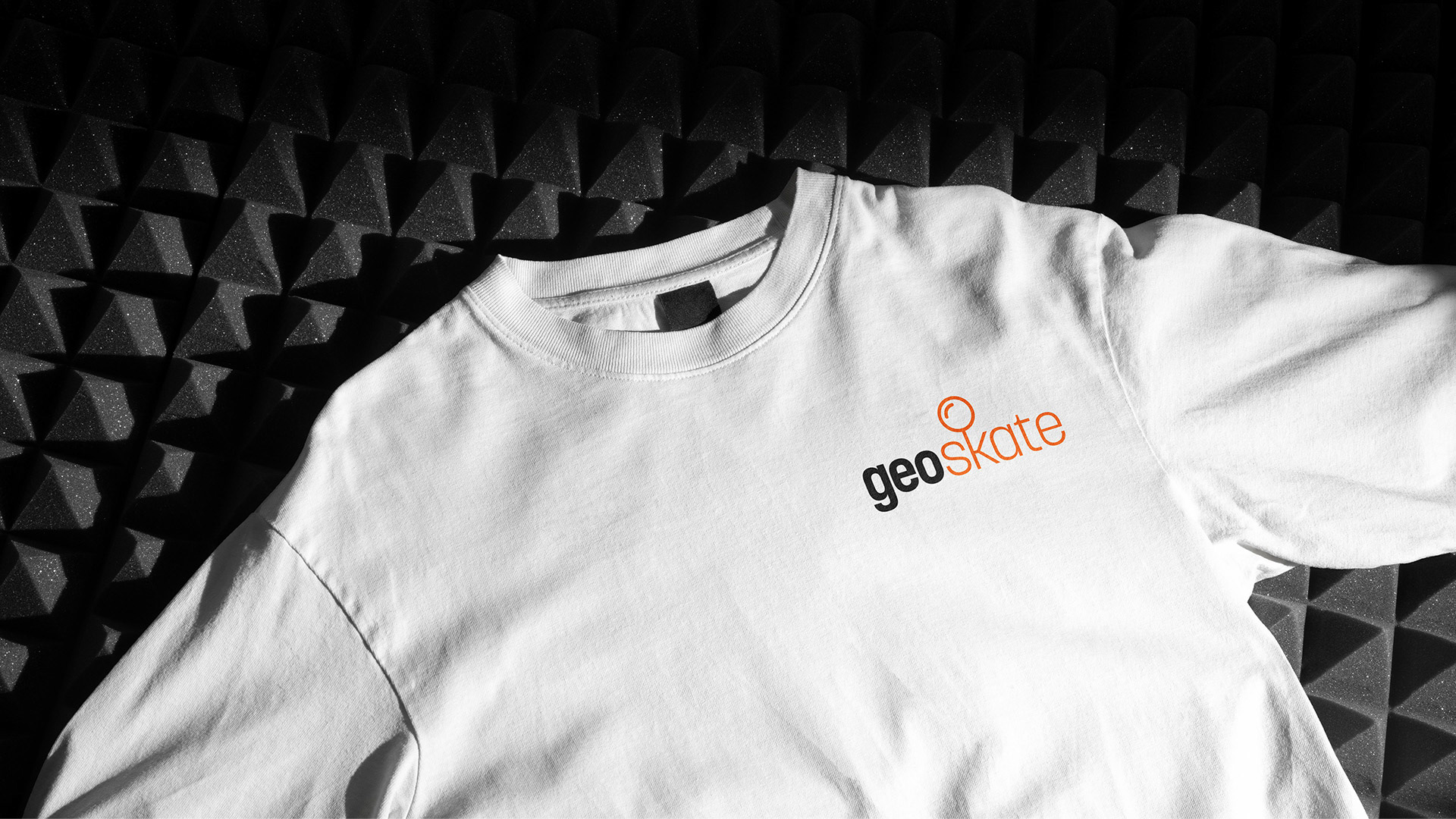
Final Logo
Key Elements
01
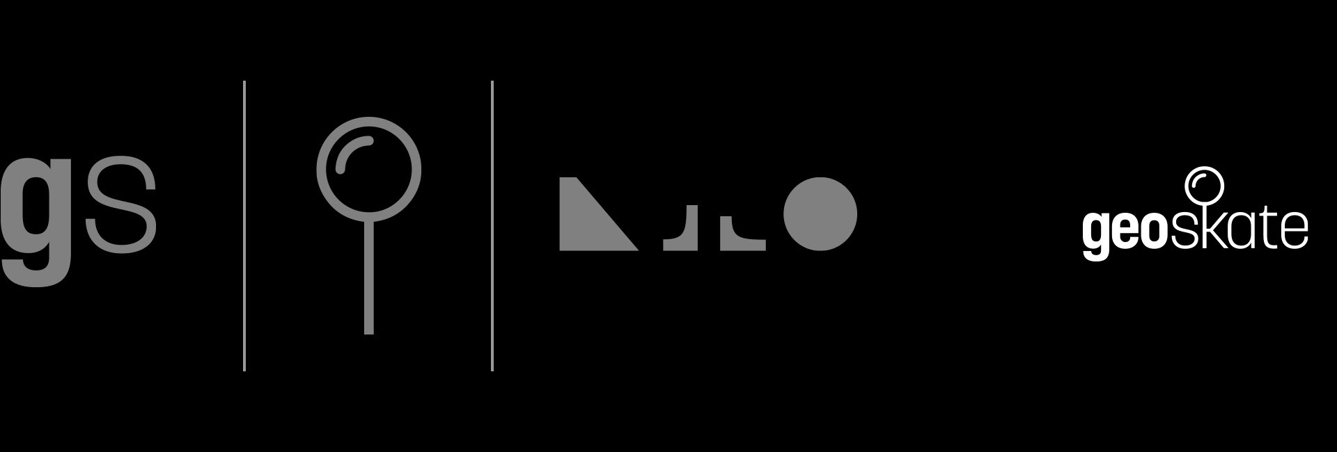
The typeface selected for the logo is Korolev; a bold, modern, and geometric sans-serif font. It supports multiple weights and has a clean, strong, and versatile design that resonates with the skateboarding community. Its modern touch ensures that the logo feels current and fresh, while its geometric design conveys a sense of stability and strength. Overall, this typeface aligns with the project's objective of creating a logo that connects with the skateboarding community and has a modern and bold aesthetic.
02
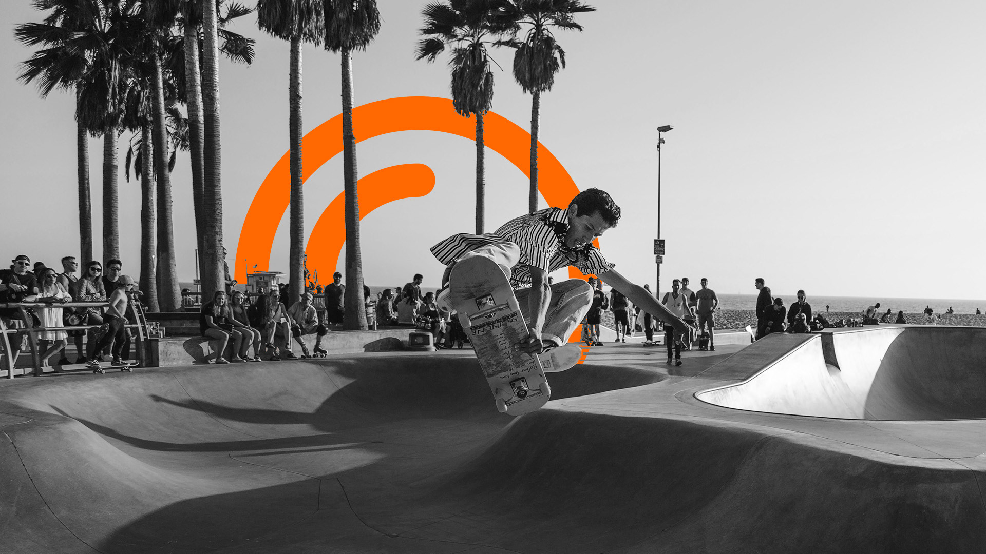
The logo features a modified letter "K" with a pin icon incorporated into it, which speaks to the app's main mapping feature. The use of this visual element adds a unique and creative touch to the logo, making it more memorable and recognizable to users.
03
Korolev typeface was also selected because of its unique Letter shapes. Above are some extracted shapes that match specific skateboarding obstacles. These help strengthens the connection to skateboarding culture, while also providing elements that can get used for other branding visuals. These custom shapes can be used for background graphics, iconography, patterns, and other branding visuals that support and enhance the brand identity.
Overall, the logo is simple yet distinctive, capturing the essence of skateboarding and the functionality of the app.
Other Logo work